MetrixMundi

Presentation

Seeing what changes.

Maps down to the 100 m grid, time series against the band of all comparison areas, profiles of the eleven areas of life, twins in Germany and Europe. For every chart, a sentence on how to read it.

Our charts

Seven ways to show an area.

All examples come from the Online Radar for the district of Merzig-Wadern, data date October 2026. In the Radar and in the report they are available for every area.

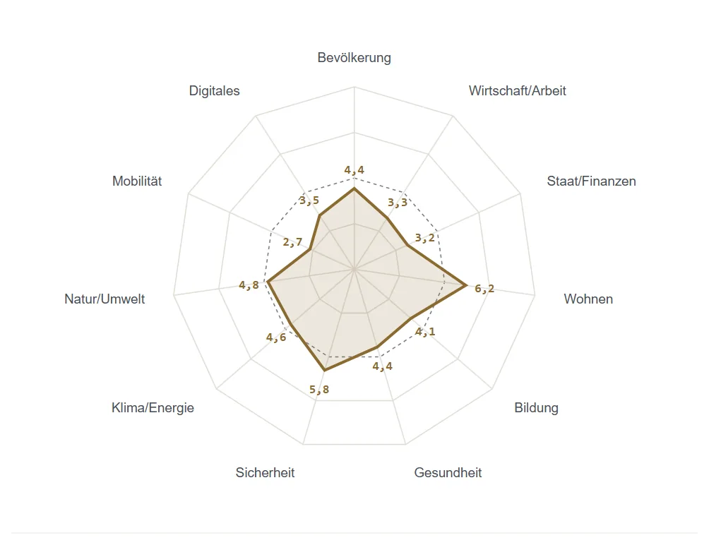
Radar chart with eleven axes for the areas of life, Merzig-Wadern as a gold area, Saarland dashed

Radar chart

Profile of the eleven life areas

How to read it
Each axis is a life area; further out is better. Gold is your area, dashed is the average of the parent level. The scores from 0 to 10 are based on the rank among all comparison areas.
What for
Strengths and weaknesses at a glance – without an overall score.
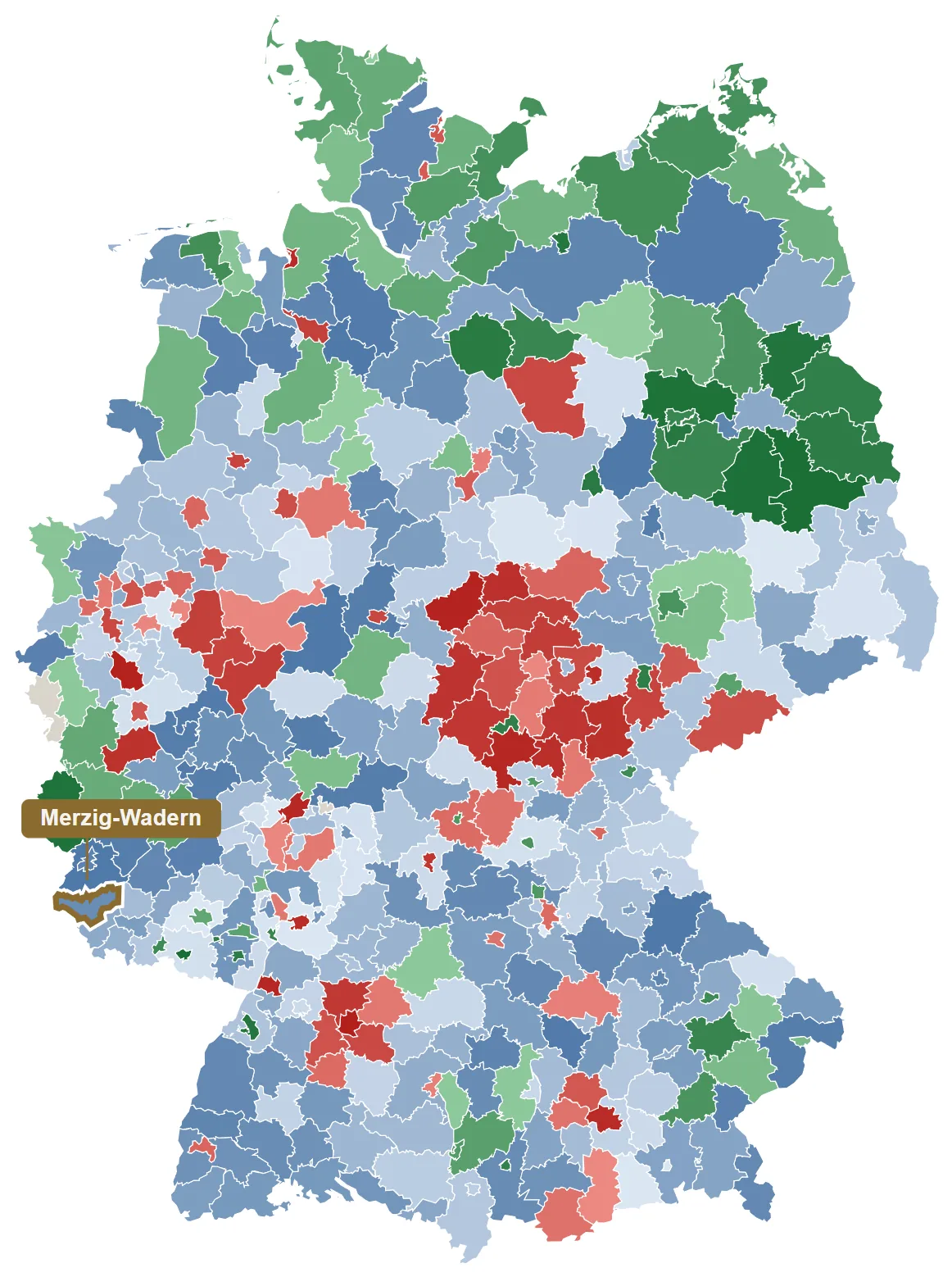
Map of Germany showing all 400 districts in red, blue and green, Merzig-Wadern marked in gold

Traffic-light map

Map of all areas

How to read it
Red marks the least favourable 20%, blue the middle 60%, green the most favourable 20% – for every indicator, with your own area marked in gold. What “favourable” means is stated with the indicator.
What for
Recognise spatial patterns: where does an area stand, where do its neighbours?
Dot strip: all districts as grey dots on one line, Merzig-Wadern as a gold dot

Dot strip

Distribution on one line

How to read it
Each dot is a comparison area, less favourable on the left, more favourable on the right. Beside it are the value, rank and the assessment “upper half” or “lower third”.
What for
See at once whether a value is normal or an outlier.
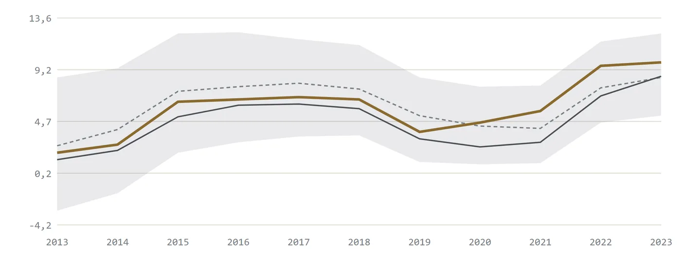
Line chart 2013 to 2023: Merzig-Wadern in gold against a grey band of all districts, plus median and Saarland

Time series

Time series with median and 80 % band

How to read it
Gold is your area, the dark line is the middle of all comparison areas, the grey band covers 80 % of them. If the gold line leaves the band, something unusual has happened.
What for
Recognise trends, tipping points and shocks – not just the latest value.
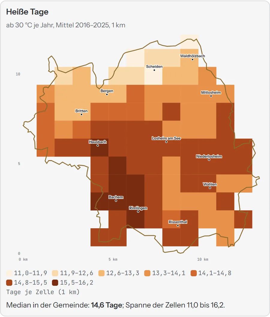
Grid map of a municipality with hot days per square kilometre in orange tones

100 m and 1 km grid

Grid maps

How to read it
Each square is a cell of 100 metres or one kilometre. The colour scale is derived from the data and is continuous, so that even small differences become visible.
What for
Differences within a municipality: heat, mobile dead spots, heating systems, climate.
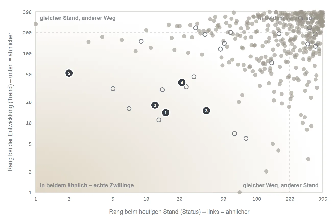
Scatter plot of all districts by similarity today and in development, five numbered twins at bottom left

Scatter plot

Twin compass

How to read it
Horizontal: similarity today; vertical: similarity of development. The true twins are at bottom left – similar in both.
What for
Finding fair comparison areas to learn from.
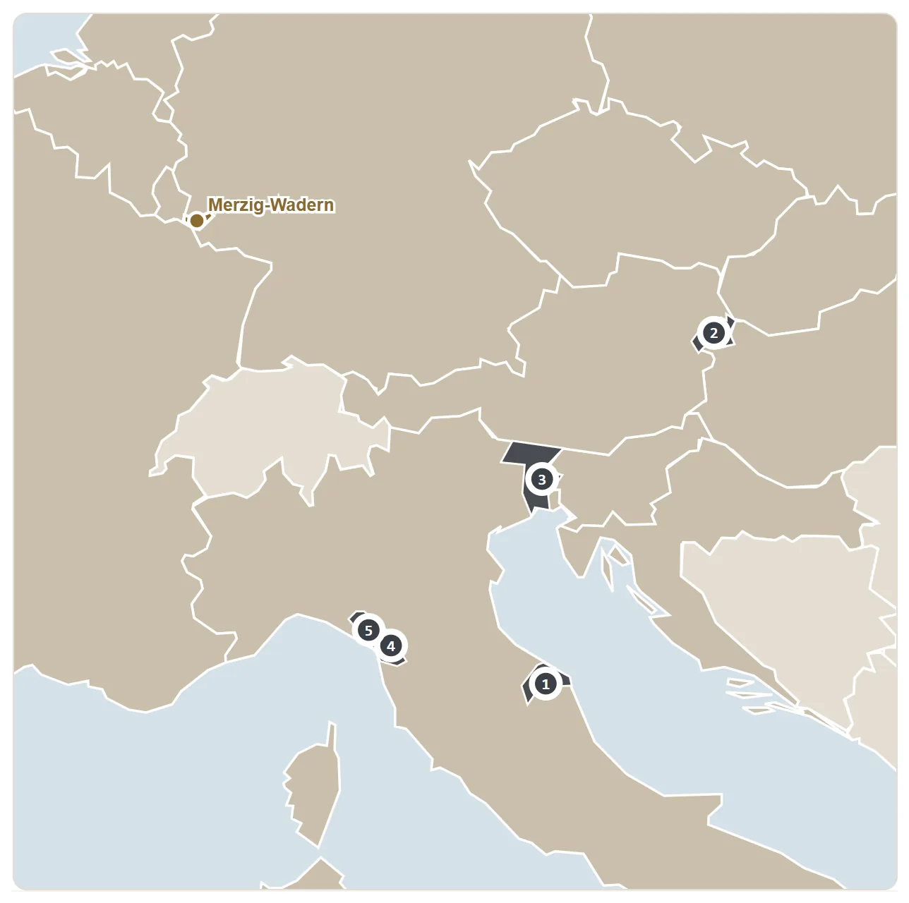
Map of Europe with Merzig-Wadern and five numbered twin regions in Italy and Austria

Map of Europe

European twins

How to read it
The numbered regions have the most similar economic structure – compared with 1,201 regions in Europe.
What for
A look across the border: who in Europe is in the same position?

Interactive and animated

Try it out: two charts in motion.

In the Online Radar every time series can be played back, every value hovered over and every map paged through by year. Two examples right here.

Mean annual temperature in the Merzig-Wadern districtTen-year means 1951–2025 on the 1 km grid · slider for the decade

Source: Deutscher Wetterdienst, CDC grids_germany (CC BY 4.0); district boundary © GeoBasis-DE / BKG; own calculation.

Time series against the band of all districtsMerzig-Wadern, Saarland, median and 80 % of districts · values on hover

Source: Bertelsmann Stiftung, Wegweiser Kommune (CC0); own calculation.

Our rules

Six rules for every chart.

Plain language on every chart

One sentence on how to read each chart, and the source below it – also in the PDF and the screenshot.

Colours from the data

Continuous scales without artificial thresholds; for climate, blue to red around the 1961–1990 mean, as in the warming stripes.

Ranges instead of single values

Median and 80 % band of all comparison areas show what is normal and what is not.

Every line in the legend

No guesswork: every line and every band has its own symbol in the legend.

Rank with assessment

Not just “rank 125” but “upper half · better than 69%”.

For reuse

As PNG, CSV or for Datawrapper – depending on licence level, always with a source line.

Get started

All charts for your area.

In the open Online Radar you can see the profile, map and time series for every EU country, every state and every district – free of charge.

View the free RadarOnline Radar and reports